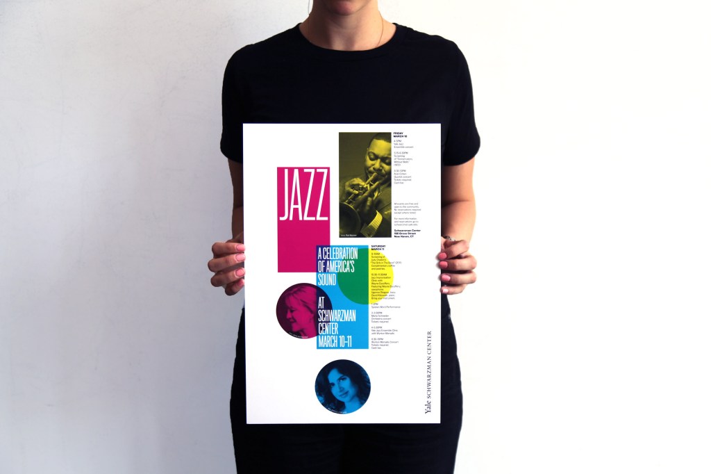
Jazz Event Design for the Yale Schwarzman Center by Pentagram Design.
This beautiful design was created by Pentagram Design for a Jazz celebration for the upcoming Stephen A. Schwarzman Center at Yale University that will be opening in 2020. This is one of a couple celebrations leading up to the opening of the new art center that helped to establish branding and design for upcoming events. This particular advertisement can be found near the bottom of the Behance article. In addition to clicking on the above image, the article can be found on this web page.
Alignment
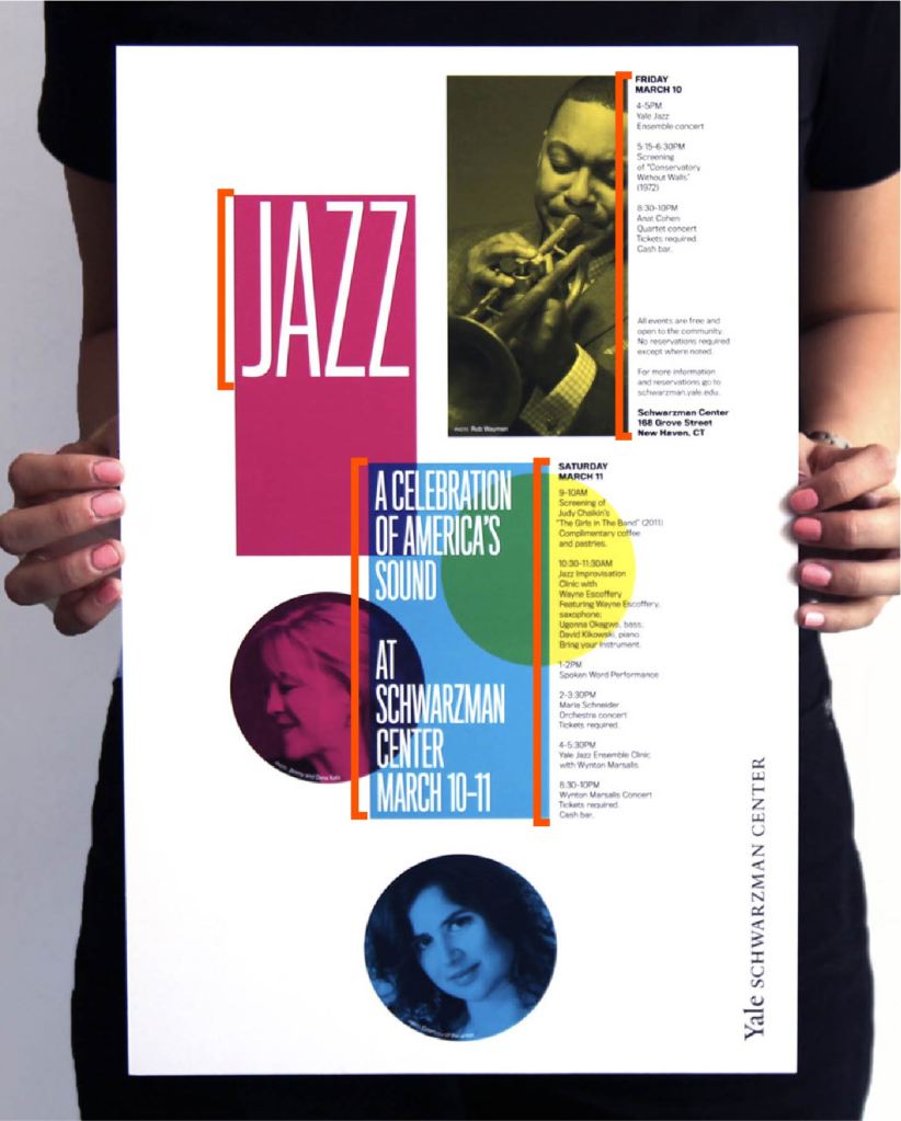
The event poster uses flush left alignments throughout the page. This brings consistency throughout the design piece and carries the eye from the top to bottom and from left to right. The titles are located and aligned on the left side of the page, while all of the information is on the right side.
Proximity
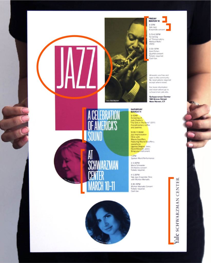
Proximity is an important design component of this poster. Based on how items and groups of information are in proximity of each other, the reader can understand their importance and relevance to other information on the page with a quick glance. The title, “Jazz”, is separated from any other information on the page signifying it as the main title fo the event. The subheadings, “A Celebration of America’s Sound” and “At Schwarzman Center March 10-11”, are close enough together to suggest that they are related, but separated enough to show they are two different headings. The information about each night of the event is also grouped by the date and times for each event while still staying close enough to each other to suggest to the reader that they belong on the same day. The designer also separated the Schwarzman Center’s text logo from the rest of the poster by placing it at the bottom right hand corner to emphasize the venue.
Contrast
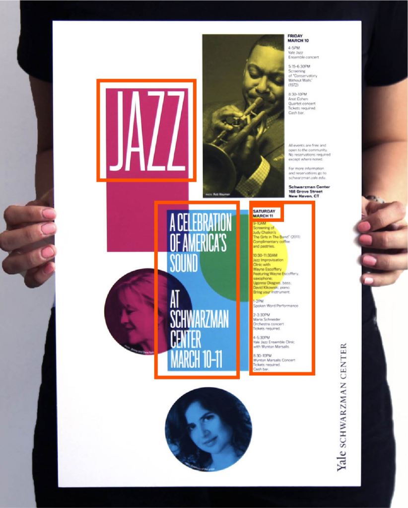
The designers used a good mix of size, font, and color variety for contrast. The title, “Jazz”, is much larger than any other text on the page showing its importance in comparison to other items on the page. The bold magenta color behind it also emphasizes this importance. While using the same typeface as the title, the headings are a clear distinction between the title and the detail information. It is emphasized by the blue box behind it for added difference. The detailed information about the event is much smaller in scale and uses a different typeface all together. This information is not highlighted by a colorful box like the other information on the page.
Color
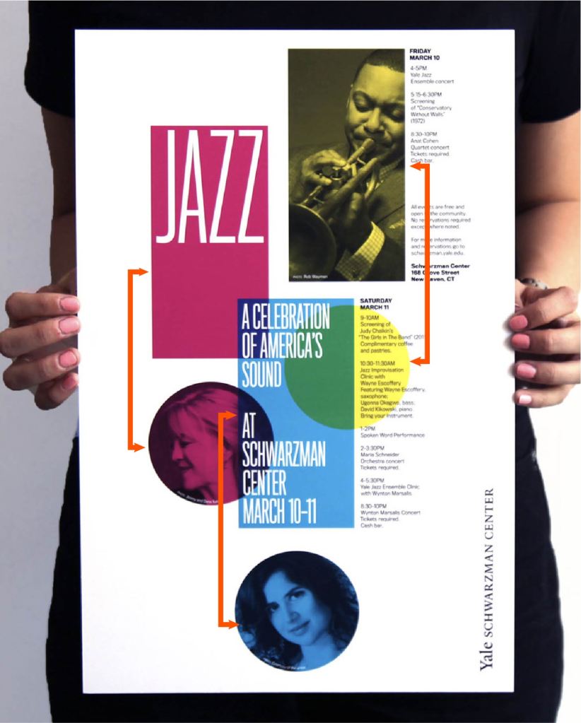
The poster has three main highlighting colors: magenta, blue, and yellow. These are a slight variation of the primary colors as well as the CMYK print ink colors. Each color highlights a significant portion of the event including its title, headings, and the specific events themselves. Adding these colors, the designers can break up information cleanly and give variety and interest to the visual components of this poster.
Repetition
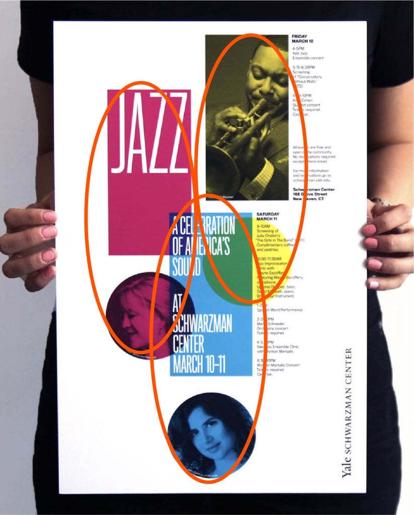
Repetition is an important part of this design piece. Not only are the fonts, colors, and alignment consistent and repeated throughout the design, the poster has reoccurring designs within it that create visual interest and help move the eye from left to right. The designers used rectangles and circles that are used to look like different exclamation points based on their color. Pictures of different performers with a color overlay give the poster a unified look and feel.
Conclusion
The unified look and feel of this project can be attributed to the relationships between the design principles and how they interact with each other. These principles help to convey clear and interesting information to the reader while not busily distracting. The unified left alignment, clear proximity of information, contrast between fonts and colors, color unity, and repetition of elements contribute to a successful and beautiful design.

